Self directed project
Develop a project around a theme or topic of your choice.
Write a brief outline of what the project is.
Write any limitations you’re setting yourself and what you expect the outcomes to be.
Starting point
I chose to work on a self directed project for this assignment as I have done a lot of competition briefs in the past, and I had an idea for a project I wanted to work upon already, but just needed the time and direction to start.
The brief
To make an animation intro for my You Tube channel as an illustration business.
Budget £0
Work on Procreate (digital art)
Have the words Ruth Goodwin Designs in the animation.
Include flowers and botanicals
Work with my Branding colours, motifs and font type.
Closed or open brief
This is a fairly closed brief, as I have set colours, motifs and fonts that I want to match my branding with. I also know in my mind roughly what I want to achieve, but of course I’m open to changes as the assignment moves on, I may change my mind!
Generate ideas:-
Spider diagram

Key words
My keywords from the spider diagram/ mind map are:-
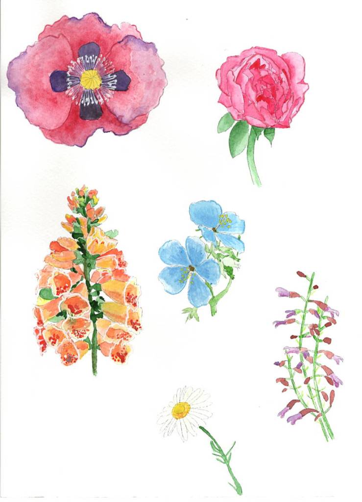
Ruth Goodwin Designs, moving letters, purple finch, blinking eye, watercolour, peony, foxglove, meadow flowers, daisy, cranesbill, washing movement.
Mood board / Pinterest board
Here is a mood board/ Pinterest board of some of the ideas from the key words above.
Research
I am going to research some You Tube intro’s that I like from two illustrators, then I’m going to research some animation for logos and gifs to help me along with ideas and how to design this.
Emily Harvey Art
Emily is a small business owner that grew her business through lockdown, originally an animator she now makes products for her shop, and also runs a Patreon and You Tube account. Emily is inspired by Disney and her work is all digital, drawn on her tablet.
Since expanding her business Emily decided to have all her branding done professionally and this included an animated intro for her You Tube channel.
I have added some of the frames below of her intro:-


I think you can see by her style that she is an animator, this self portrait was drawn by Emily of Emily, and used in the intro.
I like the simplicity of this animation, using the brush to make the typography appear, then just simple movements on Emily, like one eye winking and then blinking.
Katnipp
Katnipp or Catherine Kay as she is otherwise known, again is a small business owner that grew her business just before the Pandemic and lockdown. Catherine creates cute Kawaii inspired illustrations which she puts on to products for her shop. Catherine is very similar in the way that she has a Patreon and You Tube channel too, although is bigger and well known more than Emily.
Catherines animation for her You Tube channel she created herself, The beginning looks like a cut piece of card with illustrations which are animated on top. But I think the cut out look is created digitally as well! It’s very cutsie, but also different, something I have never seen before, unique.


The words are animated, the self portrait character gets bigger and the flowers appear. The colours are all very complementary to her branding. I guess it was made using animated software.
I then found on Pinterest some You tube intro ideas page, which gave some ideas and samples of what you could achieve.
A lot use paint droplets and brushes to create movement, also some have backgrounds that move, which I thought might be worth thinking about.
I think my design will be more simple than the two illustrators, I like the idea of the typography moving, but I won’t be doing a self portrait, but I would like to include some botanicals and animals or birds which is my style and what I’m known for. Also it needs to relate to the content of my channel, which is products and surface pattern design, painting, Illustration and learning.
Sketchbook work / drawing ideas
The next stage is to draw a few ideas from the work above, draw some motifs and just general visual workings.
I already had my logo motifs of a hand painted foxglove, cranesbill, Peony and meadow flowers, to use for some of the animation.
I went on to draw a Purple finch on Procreate to add some digital art, so there was a mix of the two.

I also had my branding font which I would use for the name on the animation.
Thumbnails
Now I have a few sketches to work from, I can gather these into some thumbnails to really think about how the animation might look. I will also create a frame thumbnail to show the changes as the animation progresses, after deciding upon which one to take forward.

- Bird blinking, flowers blowing in the wind, and the typography dancing slightly.
- Brush strokes and the typography appearing.
- The finch walking forward the typography appearing after it.
- Typography dropping down from above and the flowers moving in the breeze.
- Brush strokes moving across the screen the typography appears after with a flower.
- Flowers appear and move in the breeze, typography fades into the screen.
I am going to have a think about each of the above ideas and see which ones I can confidently achieve, as obviously I am still new to animation.
Choosing ideas
I have downloaded animate from Adobe and looked at the 10 minute tutorial, just to see if this would fit better with wanted I wanted to achieve. I found that it was aimed more at vector art work, than hand painted designs, so I chose against this way of working, because it didn’t fit within my channel and what it was about.
I have been thinking and playing around on the iPad, of which ones I will be confident enough to tackle and make into an animation, and I think thumbnails 3 & 4 will both look the best, work with my branding and channel, and also I can manage to make into an animation.

Animation thumbnails
I used the two ideas from above to create some frame thumbnails for the animations, both needed more frames to complete properly, but it gave me an idea of what I needed to do.

Visuals/ art work
I narrowed down the design to just the 3rd idea after doing the framed thumbnails, this appealed to me more, and I felt would look the best.
So I started with the 3rd idea which was the flowers blowing in the wind at the bottom, then a little bird walking along with the typography appearing behind him, he blinks a few times.
I started by creating an animation board on Procreate of 1280 x 720 Pixels, this is the size of the You Tube film frame. I then created a loop animation at 5 seconds per frame, I wanted it slow enough that you could see the details.
I started with 4 frames to build up the flowers at the bottom, I moved the hand painted watercolours of each flower a few millimetres each time, so it looked like they were moving and blowing in the breeze. I transferred them onto the canvas as Psd files to eradicate the backgrounds.
I started with this animation of the flowers blowing in the breeze, it may need a few more frames, but I want to move onto the next stage, before I clean it up and start adding more frames, just incase I need to change something.

I then went on to finish the bird for the next stage of the animation, I coloured in the bird sketch using the 6B pencil to keep the hand drawn look, but also the Little pine drawing brush to add more texture.


I then added the bird to the animations of the breeze blowing the flowers, and built up the frames that way, I started to the add the typography before each bird in the next frames.


I was a bit unsure at this stage whether it needed some background texture? I thought maybe a washed watercolour look might work well, so I added this to the animation too.
I built this up over many frames and this is how it turned out.

The only thing I may have to change is the placement of the typography as I started to run out of room with the ‘Designs’ bit!
Annotations and changes
I came back to this after a nights sleep, but I had changed my mind quite a bit on how the animation looks! I felt it was looking a bit old, not contemporary enough, and not how I want my channel to look either!
I had already decided the bird didn’t quite work, he needed to be walking with his feet moving to make the animation look professional. I wasn’t keen on the watercolour background texture, and I wanted to make it more contemporary and modern.
So the changes I am going to make are:-
- take off the background watercolour texture.
- take the bird away for now.
- move the typography back to fit the designs in.
- Add a paint brush and a brush stroke style paint swoosh.
- add a similar design that I used for the James Bond animation a few sections back in the unit.
- Add my logo at the end.
- Re-introduce the bird.
So I took off the sky background texture but decided to leave the grass green colour at the bottom. I took the bird and the typography away from the start of the animation, so I was just left with the flowers blowing in the breeze again.
I re-introduced the bird as though he was sitting on the meadow flowers blowing in the breeze also.
Then I introduced a paint brush which I had drawn digitally in different places to give a brush stroke effect, and added these to the next few frames.
I then used the warp tool to scoop up the illustration as though I was painting with it, and turned it around and around in a circle motion.
I then added my logo very small in the centre, and then made it bigger through each frame after that.
I added the bird to the logo at the end.
The idea behind it is that the first illustration have been hand painted, then I create a digital logo from the elements.
Final animation
This is the final animation:-

I decided to cut a few frames off the beginning with just the flowers on, as I felt it was too long, I then speed up the animation from 3 seconds per frame to 5 seconds per frame, which I feel works better.
Reflection
From my original idea the animation has changed a lot through trial and error, it was how I wanted it in the beginning but found it hard to work out how to do it, but luckily through the stages of things not working right, the final outcome was what I was hoping for.
What went well
Working on Procreate animation works really well for me, it is simple to understand and easy to use, and I am really confident in using it now.
Having the motifs and elements to hand, made the brief easier, being a focused brief really helped me on this occasion.
Mixing both traditional (watercolour) and digital (Procreate brushes) media worked well together for this brief and for how I wanted the design to look.
What would you do differently next time?
overall I don’t think I would do much differently, I found that although things didn’t work out as I wanted through the process, in the end I got to where I wanted to be, and maybe if I had done things differently we would have got to the final point and finished animation as it is now.
But saying that, maybe having the confidence to try the harder designs from the beginning might shorten the process.
I didn’t choose the brush stroke design, as I thought it would be too complicated to achieve, whereas I should have tried it first to see if I could do it, as it was my preferred choice.
Up-dated 23/09/2022
After feedback from my tutor she suggested sweeping the brush at the bottom of the painted section first, and go in a clockwise motion for the animation.
Also can the animation run more smoothly?
So I started with changing the paint brush to start at the bottom of the painted section.

Then I change the frames after this one so the brush moved in a circular clock wise motion, I added in a few extra frames to make the transition easier, and flow better.


I added in a few extra frames on the logo section, to make the animation run more smoothly also, I just moved the logo slightly to the right, and added in more logos in a gradual sized reduction, so it was smoother.
I also added in a few more in-between frames on the middle section with the brush, as now that I changed it there was a few larger gaps, so I added the extra frames for more smoothness.
Here is the final animation, I agree that this flows better and where I added in extra logo frames, I made the first transition to the logo a lot smaller in size, so the logo grew bigger gradually.

**to note, the animation on my iPad docent have the white spaces on the logo section, its all one beige colour, so I think it’s the WordPress software that is making this like it is, but it’s not supposed to be there, and is not on the original.
